Time Series Chart
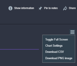
Show resulting data in a time series chart. This output![]() A document containing data sets generated by the execution of a runbook, including output of queries and reports from point products, as well as output of analysis or other runbook nodes. can be exported to a CSV or PNG file by clicking the export icon in the chart in the runbook
A document containing data sets generated by the execution of a runbook, including output of queries and reports from point products, as well as output of analysis or other runbook nodes. can be exported to a CSV or PNG file by clicking the export icon in the chart in the runbook![]() An automated workflow that executes a series of steps or tasks in response to a triggered event, such as the detection of anomalous behavior generating an incident, a lifecycle event, or a manually executed runbook. output.
An automated workflow that executes a series of steps or tasks in response to a triggered event, such as the detection of anomalous behavior generating an incident, a lifecycle event, or a manually executed runbook. output.
Properties
Node Label: Type an informative name for the Timeseries Chart node![]() Individual components that make up a runbook automation, each performing a specific function such as data queries, transformations, logic, integrations, or visualizations.. You can keep the system-provided default of "Timeseries Chart" if you wish.
Individual components that make up a runbook automation, each performing a specific function such as data queries, transformations, logic, integrations, or visualizations.. You can keep the system-provided default of "Timeseries Chart" if you wish.
Title: Type a title for the chart that will appear in the runbook output. If this is not provided the Node Label will be used.
Position in Runbook Output: Type the position you want the chart to appear in the runbook output. The runbook output is arranged vertically starting at row 1. If you have more than one visualization with the same position value, then all visualizations with that position will appear in random order.
Metrics: Select the metrics![]() A measurement or data point that is monitored and analyzed to detect anomalies and generate incidents. you want to display in the chart.
A measurement or data point that is monitored and analyzed to detect anomalies and generate incidents. you want to display in the chart.
Style: Select the style for the Timeseries chart. Choose Line, Area (the default), Stacked Area, Step, Step (Area).
Show Legend: Select this to make the legend visible.
Legend: Select the legend position relative to the chart. Choose Top (the default), Bottom, Left, or Right.
Notes: Type any notes you want to appear in the runbook output. This can include variables, e.g., "Data From {{runtime.MyCustomVariable}}"
Notes Position: Select the notes position relative to the chart. Choose Left (the default), Right, Top, or Bottom.
Custom Colors per Metric: When at least one metric is selected and all metrics use the same unit, select this to assign a specific color to each metric. A list of metrics with color swatches appears; click a swatch to choose a color.
Range Min: When Custom Colors per Metric is selected, optionally enter the minimum value for the Y-axis. Leave blank to let the chart scale automatically.
Range Max: When Custom Colors per Metric is selected, optionally enter the maximum value for the Y-axis. Leave blank to let the chart scale automatically.
Enable Color Ranges: When all selected metrics use the same unit, select this to show threshold bands or lines on the chart. Configure threshold values and colors (e.g. up to 33 green, up to 66 yellow, and anything above red). Use Threshold Style to choose how thresholds are drawn (lines, dashes, regions, gradient, or fill).
Threshold Style: Controls how color thresholds appear on the chart (e.g. solid lines, dashed lines, colored regions, gradient). Available only when Enable Color Ranges is selected. For a description of each style, see Color and threshold options for Bar Chart and Time Series Chart nodes.
Custom Y-axis range
You can define a fixed minimum and maximum for the Y-axis so that charts use a consistent scale. This makes it easier to compare metrics across charts and to focus on a specific value range.
How to set the range
When configuring the chart, add at least one metric, then select Custom Colors per Metric. The Range Min and Range Max fields become available. Enter the values that define the visible Y-axis range. The chart will always show the Y-axis from Range Min to Range Max, even when there is no data in that range.
When data is outside the range
If the actual data exceeds the range you set, the chart truncates the data visually. Values outside the range do not extend the axis. This follows standard chart behavior.
Multiple metrics and multiple Y-axes
Charts create one Y-axis per combination of unit and range. Metrics that share the same unit and the same Range Min and Range Max use the same Y-axis. Metrics with the same unit but different Range Min or Range Max values are placed on separate Y-axes.