Bubble Chart
Show resulting data in a bubble chart. This output![]() A document containing data sets generated by the execution of a runbook, including output of queries and reports from point products, as well as output of analysis or other runbook nodes. can be exported to a CSV or PNG file by clicking on the export button in the runbook
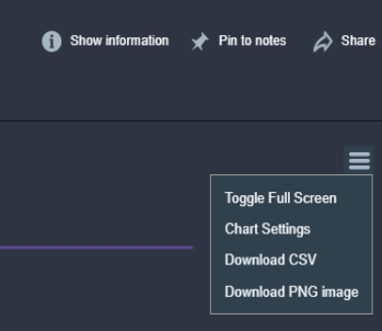
A document containing data sets generated by the execution of a runbook, including output of queries and reports from point products, as well as output of analysis or other runbook nodes. can be exported to a CSV or PNG file by clicking on the export button in the runbook![]() An automated workflow that executes a series of steps or tasks in response to a triggered event, such as the detection of anomalous behavior generating an incident, a lifecycle event, or a manually executed runbook. output. When looking at a bubble chart in the runbook output, click on the export icon in the chart:
An automated workflow that executes a series of steps or tasks in response to a triggered event, such as the detection of anomalous behavior generating an incident, a lifecycle event, or a manually executed runbook. output. When looking at a bubble chart in the runbook output, click on the export icon in the chart:
Properties
Node Label: Type an informative name for the Bubble Chart node![]() Individual components that make up a runbook automation, each performing a specific function such as data queries, transformations, logic, integrations, or visualizations.. You can keep the system-provided default of "Bubble Chart" if you wish.
Individual components that make up a runbook automation, each performing a specific function such as data queries, transformations, logic, integrations, or visualizations.. You can keep the system-provided default of "Bubble Chart" if you wish.
Title: Type a title for the chart that will appear in the runbook output. If this is not provided the Node Label will be used.
Position in Runbook Output: Type the position you want the chart to appear in the runbook output. The runbook output is arranged vertically starting at row 1. If you have more than one visualization with the same position value, then all visualizations with that position will appear in random order.
Size Metric: Select the metric![]() A measurement or data point that is monitored and analyzed to detect anomalies and generate incidents. you want to control the size of each bubble.
A measurement or data point that is monitored and analyzed to detect anomalies and generate incidents. you want to control the size of each bubble.
Color Metric: Select the metric you want to control the color of each bubble.
Show Value: Select this to show the value of the metric in the bubble.
Show Legend: Select this to make the legend visible.
Legend: Select the legend position relative to the chart. Choose Top (the default), Bottom, Left, or Right.
Notes: Type any notes you want to appear in the runbook output. This can include variables, e.g., "Data From {{runtime.MyCustomVariable}}"
Notes Position: Select the notes position relative to the chart. Choose Left (the default), Right, Top, or Bottom.
Enable Color Ranges: When a color metric is selected, select this to colorize each bubble by the color metric value using thresholds you define. Without this, bubbles are colored by a default gradient from the minimum to the maximum color value. With Enable Color Ranges, you set threshold values and a color for each (for example, up to 33 green, up to 66 yellow, anything above red). You choose which value range is good or bad by how you set the thresholds and colors (e.g. low values red for retransmissions, or high values red for MOS score).
Threshold Style: When Enable Color Ranges is selected, choose how bubble colors are applied from your thresholds. Gradient (default) blends colors smoothly between threshold values. Fill uses a single solid color per threshold band (no blending). Bubble charts support only these two styles.