Gauges
Show resulting data in a dial with a needle. This output![]() A document containing data sets generated by the execution of a runbook, including output of queries and reports from point products, as well as output of analysis or other runbook nodes. can be exported to a CSV or PNG file by clicking on the export button in the runbook
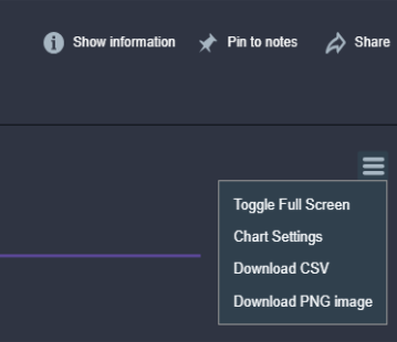
A document containing data sets generated by the execution of a runbook, including output of queries and reports from point products, as well as output of analysis or other runbook nodes. can be exported to a CSV or PNG file by clicking on the export button in the runbook![]() An automated workflow that executes a series of steps or tasks in response to a triggered event, such as the detection of anomalous behavior generating an incident, a lifecycle event, or a manually executed runbook. output. When looking at a gauge chart in the runbook output, click on the export icon in the chart:
An automated workflow that executes a series of steps or tasks in response to a triggered event, such as the detection of anomalous behavior generating an incident, a lifecycle event, or a manually executed runbook. output. When looking at a gauge chart in the runbook output, click on the export icon in the chart:
Properties
Node Label: Type an informative name for the Gauges node![]() Individual components that make up a runbook automation, each performing a specific function such as data queries, transformations, logic, integrations, or visualizations.. You can keep the system-provided default of "Gauges" if you wish.
Individual components that make up a runbook automation, each performing a specific function such as data queries, transformations, logic, integrations, or visualizations.. You can keep the system-provided default of "Gauges" if you wish.
Title: Type a title for the chart that will appear in the runbook output. If this is not provided the Node Label will be used.
Position in Runbook Output: Type the position you want the gauges to appear in the runbook output. The runbook output is arranged vertically starting at row 1. If you have more than one visualization with the same position value, then all visualizations with that position will appear in random order.
Metrics: Select the metrics![]() A measurement or data point that is monitored and analyzed to detect anomalies and generate incidents. you want to display in the gauges.
A measurement or data point that is monitored and analyzed to detect anomalies and generate incidents. you want to display in the gauges.
Gauge Min: Sets the minimum value on the gauge visualization![]() A runbook node category that shows data in a chart, graph, table, or note, providing visual representation of analysis results in runbook output. (default 0).
A runbook node category that shows data in a chart, graph, table, or note, providing visual representation of analysis results in runbook output. (default 0).
Gauge Max: Sets the maximum value on the gauge visualization (default 100).
Enable Color Ranges: When enabled, you can customize how the gauges visualization appears in the output. You can create multiple color ranges. By default three color ranges are configured:
-
Up to 33 is green.
-
Up to 66 is yellow.
-
Anything above the highest configured value is red.
You can configure which numerical values trigger different colors and customize the colors by hex value or RGB selection.
Show Full-Range Arc: When enabled, shows an arc above the gauge output with the customized color ranges.
Notes: Type any notes you want to appear in the runbook output. This can include variables, e.g., "Data From {{runtime.MyCustomVariable}}"
Notes Position: Select the notes position relative to the chart. Choose Left (the default), Right, Top, or Bottom.
Runbook Compatibility
Incident, On-Demand, External (Webhook)